Healthcare
Logo design
Modernization of company logotype AVENIER
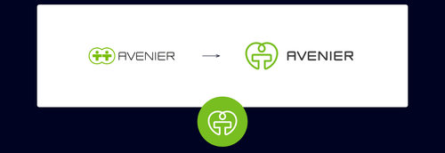
We were approached by Avenier with the need to modernize the existing logo. The assignment also included easier use of the logotype on social networks. After a thorough analysis of the current logotype, the following shortcomings were identified.
Shortcomings:
1. The text part of the logo consists of a tasteful sans serif font, however the cut is subtle.
2. The pictorial part of the logo consists of two characters, but the design is "illegible" at first glance. The width is twice the height, unsuitable for use as an icon on social networks.
Solution:
1. Enhancement and light typing.
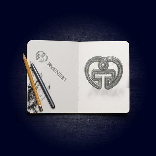
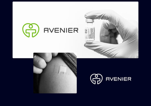
2. Complete reworking of the symbol. He is inspired by the original characters, but is gracefully drawn in one stroke to the shape of a heart. We tend to display the general symbol of health.


